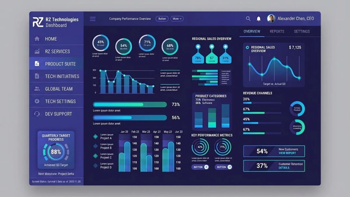
Originally, using darker colors against a white background in a dark mode dashboard was just an option. However, at this point, the top dashboards of 2027 will be those that balance simple but attractive visuals with smart data display, accessibility for disabled or visually impaired users, good mobile layouts, quick responsiveness, and, of course, give the user the feeling of actually using data as part of the product design itself. Besides being aesthetically pleasing, a modern dark-style dashboard should also make it easy for the user to quickly understand the information, carry out tasks comfortably without straining the eyes, and stay focused even during long working sessions.
In fact, the dark mode trend is rapidly expanding from SaaS tools (where users mainly see dashboards) and analytics dashboards to healthcare and financial dashboards, as well as enterprise admin panels. It's quite impressive that this design choice, which started as a preference of a small group who liked the look of dark mode, is now making a mark on every kind of modern UI/UX design.
However, just switching the background of a white dashboard to a black one and putting white text on it is not the real way to a good dark dashboard. An effective dark mode dashboard will require the design of color, typography, spacing, components, charts, navigation, and interaction patterns to be done in a very thoughtful way.
What's more, this post highlights some really dark mode dashboard designs of 2027 that are a great fit for modern-day UI/UX design and gives the reader a glimpse into the design principles that were used to make them. No matter if you are a UI/design student wanting to learn the tricks of a professional designer, a developer of the backend side of the admin panel, a founder of a SaaS startup looking for a nice-looking yet functional dashboard product, or simply you are running a small business and need a brand new web application dashboard to be designed by some design experts and developers - these principles should help you in that process.
A dark mode dashboard is a kind of screen where the main idea is that the background color is dark and the text and interface elements are light-colored, so that it doesn't strain the eyes for a long time. Instead of presenting the information in the typical way that a white screen does, the dark-colored screen uses colors on the dark end of the spectrum like charcoal, dark gray, dark navy blue, or near black.
Websites that allow their users to choose between light and dark mode are not limited. Dashboards, SaaS products, and various user-centered applications like project management tools are just some of the products where dark mode dashboards have the main role to play because of the nature of those products that involve users looking at the screens for quite a while.
But the bottom line is - dark mode is different from just color inversion. If you want a good-looking dark dashboard, you must treat it as a single cohesive system. All parts are to be designed from the ground up: background, cards, borders, text, icons, buttons, graphs, alerts, hover effects, states, etc. They all contribute to the experience of the user.
Let's take another example: Material Design. Instead of just turning dark mode into another color palette for light and dark mode (black and white), Material Design comes up with several different kinds of dark surfaces with different degrees of lightness and then carefully designs and controls the use of contrast. Also, it gives recommendations on what to look for when implementing a dark mode, such as staying clear without overloading dark surfaces with overly bright elements that could cause eye strain, and maintaining a good hierarchy and legibility.
Dashboards serve as the main interfaces of the software in many cases, and a good dashboard makes the user feel the ease of working with the app. In contrast to a website where most users see it only a few times, the dashboard is normally the screen you see daily. A user may, for example, open a dashboard at the moment the day starts, look at it throughout the day, or work with it for several hours non-stop.
Because of this, the user experience takes precedence over aesthetic design.
Dark mode creates a sort of focused space for your work because the colors of the important metrics, charts, buttons, and notifications, etc., that you have at your disposal contrast against the dull colors of the background so that they attract your eyes and mind. Because of this, it's not so big a surprise, perhaps, that dark mode is a preferred choice of design for dashboards, developers' workspaces, analytical tools, monitoring services, and other products with a high data content.
A dark mode dashboard can greatly enhance a design when it is built on the foundation of hierarchy.
When a user first interacts with a dashboard, the top metrics are supposed to catch their attention instantly.
The user should be able to recognize the most important metrics at first glance, as those should be visually highlighted; the secondary ones may remain visible but are not the focus, and a detailed view is provided upon request.
That said, dashboard design essentially involves establishing a clear relationship between metrics, trends, actions, and details.
One example could be the sales dashboard, where revenue, number of orders, conversion rate, and customer growth rate are put at the top, while the summary metrics show revenue trends, customer behavior analysis, sales data, and customer acquisition data on the same level, and transaction details on a different one.
A dark mode should highlight the elements in the hierarchy rather than the dark itself being the focus.
Dashboards of today tend to make users understand the content without effort as much as possible at a glance.
That is possible as a well-structured layout guides through an interface where first the attention is brought to the important metric, then the user is made familiar with its trends, and lastly the underlying details become the focus of the investigation.
This concept is especially crucial for dark mode dashboards since too many contrasting colors, overly bright hues, and visually busy elements would easily lead a viewer in a dark interface to a feeling of clutter.
Dark SaaS dashboard design is among the most common types of dark mode implementation. A modern SaaS dashboard consists of features like a sidebar, top navigation, KPI indicators, graphs, recent activity, alerts, account settings, etc.
Great dark SaaS dashboards are minimalist in color. Rather than using different colored cards every time, they show color variation and depth through subtle background surface differences.
The background color is very dark; the sidebar is a bit lighter than the background, elevated cards, and the surface for dropdown menus or modal windows is the lightest.
Thus, it becomes possible to present different levels of visual elements at once while not depending too much on shadows. However, the background color should not distract the user's attention in the main content area.
Main content should remain visually quiet. Use your bright accent color for things like important actions, navigation items with their highlight status, upward-trending metrics, alerts, or other meaningful states.
Overall, this method of design makes the dashboard look premium while still being highly functional.
In the first place, the analytics dashboard is very appropriate for dark mode since the use of charts and infographics can make a dark background very effective.
At its simplest level, an analytical dashboard is a tool that shows your data so that even the average user who just walks in will be able to see that you have data without a decoder of some sort at all.
For a chart to stand out from its environment on a dark background, the background and the chart need to have a high level of contrast. Gridlines should, as a rule, be very subtle, and the labels should be easily readable while not taking away attention from the data itself.
In addition to their visual qualities, the colors can carry meaning too.
If, for instance, a red color stands for a losing scenario and a green color represents a successful scenario, then the application should keep that consistent throughout.
That is to say, decorative colors should not overshadow or be visually overwhelming compared to the meaning-based colors (i.e., the red/green ones).
Finally, the dashboard itself should not only express information through colors - the dashboard can represent state information through text, icons, position, or shape in addition to the color representation of the state. As a result, accessibility is greatly improved for people who do not see some colors well and have a hard time distinguishing them at all.
Admin dashboards typically feature a large number of controls which far exceed what one would find in consumer-facing interfaces. Admin dashboards can include such things as user accounts, privileges settings, reports, settings, content management, system monitoring, and configuration tools.
Because of this complexity, navigation becomes a very vital factor.
A dark admin dashboard should have an attractive sidebar with a strong, clear structure of the active state against the inactive one.
Only the top-level item that is selected needs to draw attention, but without being very bright.
Icons assist users in finding their way through the navigation very quickly, but they should serve as a help to understand text, not as a replacement when the meaning is obscure.
In dark admin dashboards, the section with content is usually a bit tricky. That could result from differences in padding, border radius, fonts, and alignment of every single card if one is allowed to go with these things as if it were their choice.
A strong visual identity of the system would allow the problem to be settled by setting up a set of reusable design rules for cards, inputs, buttons, tables, tabs, badges, and navigation components. These design choices will not only enhance the visual appearance of the product, but they will also significantly increase the product developers' productivity.
Dark mode needs to be handled with a very high level of care in financial dashboards.
Users may be looking at their balances, checking transactions, following their investments, getting market information, revenue, expenses, or financial forecasts, and even very small inaccuracies in visual hierarchy can lead to serious usability problems.
Therefore, a financial dashboard should focus on clarity at all times. The visuals should not distract, as long as the functionality is there.
Very important numbers should be presented in a way that they immediately get a reader's attention.
Currency symbols should always be in the right place.
The colors of positive and negative values must be different, but the interface should not have lots of small red/green boxes.
Only by using the slightest dark background can you highlight the financial chart and still have a nice visual feel to it, but the saturation of your color palette has to be very well managed; otherwise, you risk ruining your users' experience.
Your main objective is not to design the dashboard to look like a fancy futuristic trading hall. It is about making the user comfortable with the information he or she is looking for so that he or she can process it efficiently.
The primary purpose of a dark CRM dashboard is to bring all the customer data, sales processes, correspondence history, tasks, and performance indicators together.
With a proper hierarchy in the visuals, dark CRM software can be really effective for users.
Sales representatives are often looking for information such as their daily tasks, new potential clients, pipeline value, conversion rates, and recent customer activity after logging in.
Hence, the dashboard needs to show them the most recent and important information.
Modern CRM interfaces will probably not present a long series of ten different charts at the top but instead place a small number of key performance indicator cards at that level and follow it with a pipeline visualization and an activity log of customers in case that has to be included.
The purpose of the dark theme is not just to make the CRM appear more modern, but it needs to help the employees to quickly and confidently comprehend the information.
The software for keeping your project management under control gives you a lot of information - projects, tasks, deadlines, team members, progress bars, priorities, comments, and notes!
A dark project management dashboard would certainly create a distraction-free work environment, especially for a user who is spending several hours a day looking over their project management system.
The biggest problem is simply the sheer volume of information.
If every task, label, button, and status were brightly colored, the interface would become visually overwhelming to the user. A more effective method is to leave most of the interface components as they are and only color them when the color tells the user something, so that the main purpose, the work, gets all the necessary attention and energy.
For example, project status could be represented using just a faint accent color while over-the-limit date tasks could have a strong, red warning color.
Spacing is just as important. The more crowded the dashboard, the more room the users need so they can tell one set of information apart from another.
Developer tools are another typical dark theme environment.
Most developers spend time in code editors, logs, viewing API responses, monitoring, deployment, database, system, and technical data.
Dark themes have, therefore, become closely identified with the development experience
Still, of course, a great designer would make an effort to deliver a great UX through the developer dashboard.
A dark dashboard with neon colors doesn't guarantee a professional developer dashboard.
Developer-style colors should be used sparingly.
Logs, messages, deployment statuses, server health, and performance metrics should stand out visually through different methods.
A dashboard should be intuitive: clear states that tell when the user is clicking, filtering, selecting from an options menu, tab, and a selected button, among other interactive states.
The color scheme you use will be one of your darkest secrets if dark mode is your theme.
To start with, black-on-white is the wrong way, and pure white is the wrong one too.
Black and white in combination indeed give you the most extreme contrast, but your design will end up very harsh and unpleasant for your users.
Currently, the most popular dark mode UI's make use of various shades of black-gray, carbon, or black and blue.
Piece of cake: a deep shade of black for backgrounds, and a medium level of gray for the cards.
A different background can be assigned for the navigator, and yet another for modal windows.
Layering dark colors is an effective way of creating a sense of depth.
Material Design's dark mode theme is a great example of how to use different dark gray shades of the background to build a visual hierarchy.
The use of softer grey tones for backgrounds and precise control over contrast is also one of the ways to design a dark mode.
Although the colors depend entirely on the brand and product, this basic idea is still valid: using a few dark shades rather than sticking with just one dark color throughout.
A black background can be quite stark and harsh, especially with white text contrast. As a result, the interface might lack depth and texture.
Instead, it's better to use a slightly lighter dark to create a cozier and more adaptable visual setting for the eye.
A designer can, for example, choose a rich charcoal gray for most background areas, and lighter gray for the cards, with another color for floating components as a surface contrast.
Borders and separation become more manageable.
A pure black everywhere surface leads to an over-reliance on bright borders or shadows to highlight surfaces. However, this technique can result in a cluttered look of your entire design.
Picking a good combination of black-toned colors to serve different surface levels will be a more elegant solution.
In dark mode interfaces, careful control of text background contrast becomes a particularly significant aspect to look into.
Bigger headings could be white text, whereas soft grey could be secondary text; it shouldn't become so light that users cannot make out what is there.
To look modern, the dashboard must create a clear font hierarchy.
The header should be the most prominent part of the text, followed by the section headings. Then, the labels are supposed to be less eye-catching than the headings. The numbers are meant to attract attention compared to their descriptions.
The selection of typeface weight, type size, line spacing, and tracking are all elements that work together to set a hierarchy.
If, by mistake, one uses all white for text color, the visual hierarchy is eliminated, and everything looks flat as you get a uniform design.
Make use of multiple levels of text instead.
Your main content can be bold enough to read easily. Other supporting text may have a weaker tone. Some captions might just be faint, and disabled features will probably be quite faint.
The main idea is that the viewer would naturally direct the gaze to the most relevant information without trying.
When designing dark dashboards, it should be clear to you right from the start that accessibility is as important as the appearance of your dashboard.
It might look nice in a mock-up, but a different color on a screen or the light in the office being very strong may mean that a product would be impossible to use for someone with poor eyesight.
Hence, color contrast should preferably be tested.
Apple's design guidelines advocate that good contrast should be maintained and mention that a 4.5:1 contrast level may be considered a minimum for most of the background and foreground combinations, but smaller text in particular benefits more from a higher level of contrast.
This same concept applies to dashboards.
Text and icons, buttons, input fields, charts, and states showing interaction should stay identifiable.
States of being focused are equally vital too. Those who operate the keyboard ought to be aware of which control has been put in focus by keyboard. So, a ring of focus which is very lightly shaded may well be able to do so without compromising the aesthetics.
Error number one with dark mode is making it by just reversing the colors of the light mode dashboard.
Unfortunately, the outcome is almost certainly not very good because the white background's color contrast and layout of elements that look good don't necessarily carry over to a dark background.
One issue is that shadows become so faint they get lost in the darkness. Also, too much black makes the borders look heavy. Brand colors may lose their meaning, as if their shade is too dark. Text becomes unpleasing to read. Charts lose their nice-looking balance.
A dark-themed set of design elements, therefore, should be viewed as another expression of the design concept.
The layout structure, the way in which we present information, etc., can largely stay the same. The elements like colors, the elevation level model, borders, illustrations, and even the color contrasts between background and foreground, however, should be reworked.
The latest UI guidelines from the top authorities consistently recommend dark mode as one distinct design that's not just the light mode turned upside down. It's a completely different mode, so it must be created on purpose.
Light background interfaces often rely on shadows to suggest depth.
Dark background interfaces necessitate another strategy.
This is so because shadows are not only visually different; they may also appear differently. Modern dark dashboards have therefore chosen to focus more on changes in surface brightness.
One example is when the surface is darker than the background of the page. In this case, the card is somewhat darker than the background.
This brings forward the feeling of three-dimensionality while avoiding large shadows.
Usually, it is a much more refined and elegant look.
To give you an idea, one of the most popular layout options besides the tabs is the cards layout on dashboards. But, a few more of these little cards will start to look disjointed on the screen very quickly.
It is recommended here that you make use of cards only when doing so will allow you to cluster similar pieces of content effectively and not otherwise.
Take it as an example: a KPI Card is basically a figure with a caption and maybe some trend indicator and a tiny paragraph that is meant to support reading and so on.
A good card should tackle one main issue.
As an example, the revenue card should be solely dedicated to the topic of revenue, without incorporating other metrics such as number of customers or conversion rate, besides of course one or two unrelated metrics.
By doing this, you make the whole dashboard more efficient for a quick look.
Card borders must be quite light too. If the border becomes very bright in color, it will distract visually, while a lack of a border entirely can make neighboring elements appear to melt into each other.
Navigation also forms a large part of the aesthetic design.
A sidebar is usually the go-to navigation format for dashboards of admin and SaaS applications, as its size allows for the inclusion of various sections.
On dark dashboards, the sidebar can be a very slightly different shade from the background of the dashboard.
The highlighted navigation item should be easy to spot through either a color background change/ highlighting, a different text font weight, a change in the icon color, or a faint background highlight.
Also, the hover effect should be visible, though not too intense.
In short, an excellent navigation should have three aspects instantly apparent to the user: I am here, I can go there, and I can be doing this.
Buttons are important, and they should reflect their roles visually.
Brand colored primary button. Secondary button: a surface that is dark but slightly raised with a subtle border. Tertiary buttons are text or icon only.
The main problem is when all buttons are bright colors, as it is difficult to recognize which of them is the main action. Secondary one.
Contrast matters more in dark mode because bright buttons are attention-grabbing by default.
That means the most prominent visual effect should only be given to whatever action is most crucial at the moment in the interface.
Charts and dark mode: a successful combination
The visual centerpiece of most dashboard interfaces is the charts.
When using a black background, the data becomes more dynamic-looking. At the same time, the chart's composition has to be well planned.
Gridlines are usually quite unnoticeable. The axis labels are there in order to make the chart more readable, but their font size should be chosen in such a way that the labels are visible and yet they are not distracting.
You can even choose very vivid colors to draw attention to the most significant series, as long as it does not produce visual fatigue.
It's a nice idea if the colors used in the chart are the neutral background color that comes from the theme's primary color, a bright colored accent, and other very carefully picked colors.
In dark dashboards, the tooltips should be in the dark style. They have to be lifted surfaces with legible and clean typefaces, as well as high contrast.
When the same dark background is repeated in each row for a table, it can be hard to find the row you are after.
A current table should be able to visually separate the rows without making each row look just like a heavy card.
Minor borders, hover effects, gaps between rows, and typography can help in laying the framework.
After a row is clicked and highlighted, it has to become obvious. Semantic coloring of important cells should not be the whole row turning colorful.
Tables also must respond to the user's screen size. Deciding whether the designers' columns should get squashed, scrolled sideways, or highlight the most essential information comes at the expense of smaller device screens.
There's another area where dark mode often comes up lacking - forms.
This requires a great contrast between the forms themselves and the surroundings. Using either a slightly elevated background or border will really do the trick when done subtly.
Placeholder text and entered text might end up being mistaken for one another if you don't be careful. The visibility and legibility of the labels should be kept intact.
When the focus changes, the difference should definitely be evident.
Making an error just a red border is not enough. An effectively communicated error state for accessibility also needs to include a message describing what happened and what the user can do to fix it.
We care about these small nuances in UX because users often carry out important tasks here via forms.
The user should sense the modernity in dashboard features.
Little changes, for instance, an animation, can convey the change, like the selection or the loading.
Still, when you have dark modes with such animations as shiny color effects or moving shadows, it turns out too bright for the eye and distracts a person from the main thing.
In fact, a microinteraction is supposed to assist the user and not delight them.
Hovering the mouse over a button causes it to change slightly. The movement of a sidebar is a little smoother, for example. When the data for the chart is updated, the entire chart animates.
But the animations will remain quick, and they are subtle.
Glassmorphism is a big trend right now in dashboard design, especially when the designs use a dark color scheme and a lot of transparency, shadows, gradients, and so on.
Nonetheless, you have to be careful, as the use of glassmorphism is a bit risky.
In fact, too much glass transparency could result in lower readability.
Putting plain text over a colorful gradient background with lots of detail or animation will make the text hard to read. As for the cards, when put over glass, they become less clear.
This is a better idea: instead of changing everything to glass, apply glass only for elements such as menus, control elements, or special areas. Then you can avoid the glass effect being overused.
Different elements using the glass effect in harmony make up the most beautiful designs, while the dominant feature being glassmorphism is just an exaggeration.
Gradients can give a darker UI color scheme a more lively appearance.
To make an image or section in the dashboard more interesting visually, you might opt for a mild blue, purple, green, or warm gradient.
Away from the main content, though, it will be wise to let the color gradients sit pretty without being the highlight.
Making sure to keep the function of the dashboard a top priority comes before anything else.
Incorporating a gradient that makes KPI numbers harder to read would be a design issue despite the image capture being impressive.
Closing a section of a dashboard visually through the use of gradients while keeping others as flat ones can really enhance user experience.
One of the major areas of development for 2027 is how dashboard designs will incorporate AI.
Data should not just be shown. Instead, the dashboard will help users make sense of the data.
Performance changes or a sudden decrease in conversions can be detected by the dashboard. Project management dashboards are another example - they alert about overdue work or potential delivery risks.
The dashboard’s role will be changed.
The user interface is no longer just a set of charts; it is a decision-making environment where users can rely on the system.
Dark mode might be ideal in these AI-focused applications since insights can then be highlighted against a calm and minimalist background.
However, users must be able to tell the AI’s recommendations apart from the data facts that the system provides.
A good dashboard design today is no longer going to be all one flavor for each user.
Sometimes a user just wants to be on dark mode 24/7. Others will have their device set to light during the day and dark mode only at night.
The operating system preferences can be an excellent suggestion for a theme.
Newest UI frameworks offer a combination of system theme switching and personal preference. Material UI, for instance, allows a person to choose between light, dark, and system-based color themes.
The ideal case scenario will be for the app to save the choice that the user made at the theme-level and the user is never shown to have a wrong kind of theme on him/her when there is a task going on.
One that seems to be an excellent UI for you on your large monitor won't be one for you if you use it on a little mobile phone.
Hence, responsive design is a must.
PC dashboards usually have lots going on with them – sidebar, a couple of columns, charts, tables, many KPIs spread across the screen.
For the sake of mobile, these elements are going to have to move around a bit.
The navigation bar gets changed to be just a side drawer. KPI cards stacked up one on top of the other. Charts may have to be made scrollable. Tables will have to decide which columns matter the most.
Pictures and the color scheme of the background should still be in harmony across different screen views with a dark theme.
Visual elements like colors, font styles, buttons, and spacing should change to the dark version without altering the style of the whole interface.
There will be an extra requirement for prioritizing the mobile dashboard.
It is unfair for the design to make an effort for user scroll through different charts while at the same time trying to find the main metric.
Therefore, the mobile version is meant to highlight what the user requires most when at a place where there is no desktop available.
Bigger touch areas are a very useful idea for mobile devices. Users can easily tap buttons and control elements.
Tiny text should still appear very clear to the eyes; it is very tedious if one needs to zoom in too much.
To say nothing of the fact that dark mode also has its implications with changing surroundings. The same dashboard might be the most comfortable way of looking in the dark, but it becomes a burden to the eyes outdoors under a strong light.
Because of all that, it’s better to test on devices.
OLED and AMOLED technology is another thing that makes the way designers work with dark interfaces change completely.
On these kinds of panels, the pixel behavior is different when the picture is dark than when it is light; thus, even the deepest interface gives a pretty visual effect, which is immersive.
Still, there is no need to conclude that the darkest black is always the best choice.
The aesthetic appeal of a dark screen depends on all the aspects of the design, such as background, font, brightness, contrast, and lighting conditions around the device.
Better to do testing and observe with your own eyes rather than rely purely on software previews.
The first problem is to use only one color, pure black, all over.
Also, it can be a disaster for the eyes to have only pure white for text.
In the third case, designers turn all elements in their designs colorful.
Excessive glow effects are the 4th problem.
Accessibility has been another area overlooked for so long.
Also, you would find that the 6th common mistake is making dark mode simply flip colors and invert the light one, so it is a poor way, you could say, of understanding.
The 7th error comes from making the number of charts and cards on the dashboard way too big.
One color used without any clear meaning or purpose is another common mistake.
Text of secondary importance should never be so faded that it gets hard for a user to catch it.
The last point is the design that works only through screenshots, the kind that gets a lot of compliments at the moment of showing it to everyone.
All these problems are those that can get you a great dashboard on paper but, after all, make it hard to work with every day.
We should always start with defining information architecture before moving on to choosing colors.
Step one: discover users' needs and goals.
Second, arrange the content into main, intermediate, and detailed tiers.
When the layout is figured out, it’s time to get to know the design system.
Describe background colors, surface colors, text levels, borders, accents, semantic states, font, margin, and component behavior.
Afterward, create the most essential elements.
Every visual item, like sidebar, topbar, KPI cards, charts, tables, forms, buttons, alerts, modals, navigation, should stick to the same layout, look, and feel.
Once all that has been done, check how the interface looks at different screen sizes or device types (i.e., desktop, tablet, smartphone).
To verify contrast, it’s recommended that one use accessibility tools only and not make a judgment.
In the end, conduct user research on the dashboard.
Despite looking nice, a dashboard might be an absolute failure if the users won't be able to find the information they want.
Design systems are a key tool and, if done well, can really streamline and speed up the process of dark themes.
Designers and developers don’t have to go on to hard-coding colors in multiple places in the code. Semantic design tokens are a very good example of these tools.
E.g., in a system, one might specify tokens for a background, a surface, elevated surface, primary text, secondary text, border, primary action, success, warning, and error colors.
Certain values of those tokens will vary according to the actual theme applied.
This method is much easier for the team to switch between light and dark as well as maintain light and dark at the same time.
It also avoids such a typical issue as one component having one shade of gray, and another component having another shade.
Being consistent is the first rule of good work in UI design.
A major asset of accent colors in dark environments is their visual dominance.
Blue continues to be the color of choice for many SaaS companies as it conveys trust. Also, it looks good against dark backgrounds.
Purple would be suitable for creative and AI companies.
Green may be the natural choice for finance, health, analytics, or any other context where the performance outcome is positive.
Orange and yellow can also make a vibrant visual impact, but they need to be handled with care.
Avoiding excess is the name of the game.
An attractive dashboard will be only a decoration if it doesn't communicate to the eye and serve the goal. Hence, an unnecessary number of accent colors isn't justified solely based on their visual appeal.
Finding the right balance between brand-related colors and a set of limited but very expressive ones should be the ultimate goal, not the number of color variations.
Dashboard design is likely to head toward an interface that is more adaptive, smart, and individually tailored to the user over time.
Light and dark modes are going to be just another feature of the theme system. Dark mode is not to be considered a separate feature anymore.
Dashboards will automatically adapt to user preferences, device screen size, amount of data shown, accessibility demands, and even potential working conditions.
Eventually, most of determining what is to be presented or highlighted will be the task of artificial intelligence.
From providing the user with endless rows of numbers to showing only those changes that are meaningful, with some explanations as well, which is what users are going to appreciate the most.
The fact that this change brings along the question of even better organization of the information is a given.
The best dashboard design in 2027 might have fewer features but still be a highly efficient one.
Its main contribution to the world of work will be helping users make the right and timely decisions.
If one thing has changed, it's the way dark surfaces are used. Designers are not sticking with just plain flat black backgrounds anymore but are bringing depth to the design by using a slight variety of different surfaces.
Apart from that, restrained color is one of the biggest trends nowadays, rather than using lots of bright accents.
AI-powered insight is another big trend in dashboards. There will be a change in the role played by dashboards in the sense that, apart from just displaying numbers, the dashboard will start to be the main source of the explanation of important events.
Responsive layout is one of the main components of user interfaces, and this will become more advanced.
In the coming years, dark mode dashboard design will also prioritize accessibility more closely. The accessibility elements such as high-contrast, easy navigation using the keyboard, visible focus indicators, good readability of fonts, and color-blindness consideration should all be integral parts of the design process and not extra elements to consider.
Personalization will also be something that users are really going to like. There's a high probability that users expect an interface that remembers their theme preference, layout choices, filters, and favorite ways to present their data.
The dark mode dashboard designs of 2027 will not just be defined by dark backgrounds and neon-colored buttons, shiny gradients, or futuristic looks.
They will be considered good if they really help users understand and carry out their tasks effectively with the information.
A good dark dashboard will have a harmonious color palette with strong typography, clear hierarchy, accessible contrast, responsive layout, accurate rendering of data visualization, and components that are in line with it.
The primary guideline is to create a dark mode interface through purposeful design choices.
· Don't invert your light dashboard merely because it’s dark mode now.
· Avoid the complete use of black for your dark mode design.
· Do not go for the bright option of the dark mode.
· Do not sacrifice usability for aesthetics.
A system visual should be developed where the dark surfaces give a sense of space, type design highlights a particular order, colors indicate meaning, and elements combine in a meaningful whole experience to deliver a seamless experience to the end-user.
The beauty of dark mode is that it complements the design of SaaS products, data analysis tools, admin dashboards, financial apps, sales and customer relationship management, project management tools, and product design for developers, among others. If the use of dark mode is properly explained and executed, the resulting interface of the product can look very up-to-date, well-designed, and pleasant for long hours, besides being the users’ favorite.
As we approach the year 2027, dashboard design is more likely to emphasize the intelligent delivery of information rather than simply displaying vast quantities of information. The major market share will belong to those that master not only the fundamentals ofUI/UXdesign but also the use of AI-generated suggestions, customizations, accessibility issues, and responsive layout.
In the end, the best dark dashboard is not the one that is most visually impressive by being pitch-dark. It is the one that helps you grasp a complicated situation in a couple of minutes and, therefore, reduces the number of errors.
Dark mode in dashboard design refers to using dark backgrounds, lighter text, faint surfaces, and selected accent colors to develop a contemporary UI. Mainly, the dark dashboard interface is a great fit for SaaS platforms, analytics tools, admin panels, CRM software, financial apps, and developer dashboards.
The significant trends include dark layered surfaces, subtle gradients, AI-based suggestions, tailored dashboards, adaptable frameworks, color palettes that is inclusive color-wise, slim navigation, data-centric charts, color accents being cleverly used, etc.
Dark mode is not inherently better than light mode. The choice of mode highly depends on the users and the application. Dark mode might be perfect for applications with large amounts of data and also for users who work long hours on dashboards, while some users could be happy with light color mode in a light environment for better visibility of the text.
You can go with a dark gray, charcoal, a dark navy, or a variety of other dark shades as your background if you're designing a dark dashboard. However, the color of your highlights should be different so that the user notices where the action is and where the data. What determines if your interface will look attractive is the contrast and visual prioritization.
It's not compulsory. A pure black background could create an immense contrast against lighter-colored text and might give the user an extremely strong impression that the text is harsh or that the interface is flat. On the contrary, several shades of dark colors such as charcoal, gray, or dark navy are used in the background of a modern dark dashboard to create a level of depth that is visually pleasing between the background, the cards, the navigation, and the raised elements.
Making your dashboard more accessible starts with having a good contrast ratio on your text and backgrounds, adding keyboard focus states as visibility indicators for those who use that input method, not relying only on color to show changes or to communicate meaning, using readable fonts that are large enough, etc. Also, you should regularly check and make sure that your dashboard complies with web accessibility standards, and you should test it with different types of assistive devices.
Dark dashboards are suitable for almost any software that has a lot of information displayed at the screen level. That includes SaaS software, analytics software, CRM software, project management software, financial software, developer tools like IDEs, monitoring tools, and more.
The dark background requires that the charts use light colors for their axes and titles so they don't get lost against the white background of the chart. However, you need to balance the brightness of the colors and the saturation to make sure the charts don't distract the viewer from other information. Also, the colors should convey the type of data the charts represent and be used consistently.
Mobile is the best place for a dark dashboard! But it requires very careful mobile UX design and development. The layout might change as your screens are different; the touch targets have to be big enough for fingers, and so on.
Modern and professional dark dashboard is a combination of minimalist color scheme, bold fonts, very well-structured information hierarchy, design that is made up of different elements used together in such a way that their individual identity is clear and the whole is aesthetically pleasing yet highly functional, color choice that allows good contrast for readability and accessibility, adaptive layouts that look good on all types of screens without being stretched or cropped, meaningful data presentation such as charts that help the user make sense of the data and, when appropriate, animated details that add flavor of interactivity or visual delight - also, there's clever use of AI-driven content insights.