Dark mode's evolution reveals that it was not just a display option but that it now holds one of the leading roles in the field of modern digital design. In fact, just a few years ago, people still perceived dark user interfaces mostly as some kind of additional feature that could be used mainly by certain groups like developers, gamers, or people working late at night. However, now in 2026, dark mode is not only one of the preferred display themes, but it has also been deeply integrated with all types of digital interactions that users carry out within various industries such as healthcare, finance, education, e-commerce, entertainment, productivity software, and AI systems. Some of the largest tech firms not only adopt dark mode for its look, but, much more importantly, to support complex digital environments in which users interact with technologies more and more.
People's love of dark mode is not all due to its aesthetic appeal. The fact is that a lot of successful dark interfaces are born out of deep knowledge about the human brain, such as psychology, cognitive science, perception of sights, emotional reactions, and even behavioral design. These days, the main question on designers' minds is not whether the application is a fit for dark mode but how dark mode impacts attention, trust, productivity, engagement, and emotional comfort of a user. Since users' digital interaction time is going up, gaining insights into psychology through interface design is becoming the number one concern.
Designing a user interface today is not merely about laying out the buttons and opting for pretty colors. Each tone, each shadow, each animation, each arrangement of elements impacts the way the user thinks, feels, and behaves during a product interaction. Dark mode is actually the embodiment of this principle. When dark mode is well- thought- out, it's a very useful technique to create different kinds of feelings (e.g., relaxation, being productive, and having trust) in the user.
On the other hand, if a dark interface is implemented poorly, it may lead to the opposite effect. For instance, the user is likely to become fatigued mentally, have issues seeing well, and possibly end up being irritated because of the experience. This contrast is exactly the reason why psychology principles now stand as fundamentals of every UI or UX design.
With 2026 being a time when AI is a major factor in changing digital interaction for the better, dark mode is being changed beyond a basic black-and-white, light-and-dark choice also. Smart tech systems have started to understand, for instance, lighting in the environment, user preferences, and user behavior, etc., and then they use that knowledge to make visual experiences more personal without user intervention. Instead of just having a button that turns dark mode on or off, some apps now can automatically change colors and brightness settings according to various external and internal conditions in real time. Such smart changes show to a large extent how both psychology and technology will be intertwined more than ever in the coming days.
In this piece, we will look into psychological aspects of dark mode design and discuss mainly why people seem to favor dark mode, how vision plays a role in the design of the interface, and also what is the main driving force behind businesses' decision-making to implement psychologically friendly user experiences.
The very early stage of computer displays was dark and bright text colors such as green and amber over black. This design was mainly driven by technical limitations of those early cathode ray tubes, and so for that time period dark screens were not a design option but a requirement.
Dark screen displays were, of course, not considered as a design choice during those years. As new display technologies came along, the gradual transition of user interfaces from dark to light backgrounds that visually matched those of paper was noticed. For many years, white or light interfaces were the industry norm because they were familiar, easy to read, and most suited to office environments.
The widespread usage of smartphones, OLED displays, and high-resolution monitors significantly changed the interface design world. Users started spending much more time in front of screens every day and, therefore, designers had to revisit the idea of optical comfort.
Companies were also trying out darker themes to lower the perceived device brightness, to enhance the battery life of OLEDs, and to give users more liberty in their experience. It was the launch of dark mode in major operating systems on mobile, desktop, and the web that acted as the catalyst. Soon after, developers jumped on the bandwagon as well.
This first visual change revealed deeper psychological benefits. By researching users' behavior, scientists found that people link dark interfaces to traits like refinement, professionalism, creativity, and premium quality.
If we had to talk about dark mode as it is in 2026, we should note that it is not just replacing whites with blacks. The new approach has to do with creating a very carefully selected palette of dark colors like charcoal, graphite, navy, and deep gray. This type of color selection helps designers maintain viewer comfort and ensure that the visual hierarchy remains while reducing eye strain from very contrasting elements.
There is also an element of the shift in our digital culture in modern dark mode trends. Users now mostly prefer their experiences to be uniquely tailored to them instead of them following some standard interfaces. Similarly, as a user is listening to music that their listening habits determine, their interface is also changing the visual theme that will fit a user's likes and also their surroundings. Dark mode has become one more tool for personal expression rather than just a preference for appearance.
If dark mode is going to affect people so much psychologically, it probably has something to do with the mechanism of the human visual system itself. The eye, the pupil, and the brain work together quite complicatedly in order to let the eye get adjusted to the different lighting conditions. A person will not really begin consciously looking at something till then that the eye has processed it through these biological mechanisms as one.
It is not only the recognition of colors that is involved in the process of visual perception. All through its operation, the brain continuously works at interpreting contrast, brightness, depth, motion, spacing, and the various visual relations. Designers commonly think that they are working for the eyes by designing something, but in truth, they are working for the brain. In fact, every design decision made by a designer affects the information processing of the user as well as the level of comfort that the user enjoys.
When an app is opened, your brain immediately starts sorting visual data into familiar images. This happens in milliseconds. For instance, contrast can capture one's attention, spacing brings order, and when the composition is balanced, the user hardly notices how much he/she actually spend the brain's energy on reading it.
Dark mode is a subtle but powerful shift from a bright white background to a darker one that changes a lot of perception processes. Bright interfaces literally pour tons of light into your eyes. Darker ones dim your surroundings.
The fact, however, is that a dark interface will not be good enough just through brightness reduction. It might be that a totally dark interface will become a reading nightmare if pure white is used for letters and pure black is used for the background. Contemporary designers do know from experience that softer tones of contrast are quite often better suited for long-term reading as they are not too harsh.
The idea of interfaces being easier to process over time can be attributed mainly to a decrease in extreme contrasts.
Beyond just aesthetic aspects, dark mode significantly affects user behavior because it triggers various psychological responses. Even though cultural aspects determine color preferences, the psychological reactions to them remain almost the same across different cultures, and these are the main ones explaining the effect of dark mode on user behavior.
Dark colors have been seen for a long time as symbolizing elegance, confidence, sophistication, authority, mystery, and luxury. The world's top automotive producers, fashion designers, watchmakers, and tech product specialists are known for using darker color schemes since they are associated with exclusivity and superior quality. These associations naturally transfer to digital interface design.
A professionally dark interface can give off vibes of being the latest tech, trustworthy, modern, etc., to users who see it at first glance. The image is built so quickly, in fact, that the features of the product are not even considered yet.
As we know, a first impression is mostly a reflection of visual features. Because of that, dark mode not only serves users but is also an efficient branding channel. It’s kind of combining both.
It’s not surprising that emotional reactions to colors are tied to memories we have of these colors. Dark colors make us think of libraries and quiet spots, places like cinemas and hotels that are considered luxurious, etc. These positive associations with darker colors are what create the need to concentrate and be immersed while operating computer programs designed with such visual features.
In dark mode, accent colors work better due to the contrast they provide. Blues are often linked with reliability and intelligence, greens are symbols for growth and success, purples indicate creativity and innovation, while oranges and reds highlight warnings or actions of vital importance. A well-balanced palette of these colors by a modern designer can give an interface great energy, and yet it stays uncluttered.
Apart from that, color psychology says that dulling the background often lessens the strain on the eye. Instead of drawing too much attention through bright colors, dark colors allow you to see the main point without being distracted by others. Users spend very little of their brainpower on separating the irrelevant bits from the visual background and more of it on decoding what you have presented to them. These small changes are the reasons why one gets much more involved when an application is dealing, say, with data manipulation or even more complicated creative operations.
In the coming years, 2026 and beyond, when it has all changed, color psychology will be one of the most effective means for digital designers. Good interface designs not just rely on beautiful looks; they provoke emotional reactions that affect how someone perceives, trusts, or is generally happy with the product at hand.
The psychology of dark mode is not just a matter of preference or aesthetics. It can greatly influence the user experience if it evokes the right kinds of emotions or if it allows easier focusing of visual attention. Dark mode can be a bit more immersive as it removes the competition from the bright background, which is usually the case. That allows the user to have a clear idea of what he should be looking at. It seems to me that dark mode also enhances concentration and focus since people have fewer visual distractions from the interface itself, thereby being able to put all their attention on the task at hand.
We’re hardwired to prefer bright, colorful visual inputs because they stand out and are easier to recognize. Darker interfaces, on the other hand, have less luminance, so they are less obtrusive and less distracting for the mind.
Bright backgrounds tend to fight for attention all the time since light or light-colored areas are continuously reflecting lots of light to the eye. On the contrary, dark ones do not seem to draw attention so easily since it is more difficult to distinguish them from the darkness, which is the general state of the background. Thus, instead of continually grabbing one’s attention by highlighting the design of the interface, the latter invites one to look at the things (text or image) that matter most by letting them "go to the foreground".
The reason behind this psychological principle is that dark environments are preferred by professionals in creative fields such as cinematographers, filmmakers, photographers, software developers, designers, analysts, and stock traders because a few hours in the same location would mean being absorbed only with what is being displayed on their computer monitor. Dark UIs help to reduce the clutter of competing visual information and keep the focus on the actual task instead of the interface that holds it.
With a good UI that allows interaction and does not distract the user with a flashy interface, one can enjoy more and more of the immersive feature when the animation is smooth, shadows are soft, spacing leaves no doubt about what to focus on, and the accent colors are picked up on purpose. Instead of being presented as separate components placed on a blank canvas, a current and stylish dark theme would produce a multilayered space that will give off the impression of being a sophisticated, large place where the user is very happy. This change of perception not only improves the whole user experience, but it is also encouraging, making users stay and focus even longer.
One of the top considerations in psychological and UX design circles is cognitive load, i.e., the brain effort necessary for processing information and completing tasks. Regardless of how minimalist it is, a screen or an app requires the user to divert some brainpower to understanding it. That includes identifying symbols, deciphering writing, drawing conclusions from graphs, picking an appropriate action among several, and switching around from one part of a product to another. If that interface includes too many visual elements, different-looking parts, or too much information, your brain works at least as much as it had to, if not more, which ultimately results in fatigue, slower decision-making, and lower satisfaction with the product.
Dark mode is really a neat idea when it comes to controlling cognitive load, as it is a means of switching which parts of a visual message we see more and which we see less. The background elements are automatically minimized by a thoughtfully conceived dark interface to such an extent that they are barely noticeable anymore. By eliminating an extra mental effort of scanning a page in all directions looking for content, the dark background makes the brain focus only on the central features. At the same time, the eye sees only the primary elements such as buttons, alerts, charts, and headlines. On the periphery, the decorations are still there, but they are in harmony with the background so one does not notice that one has been looking at them.
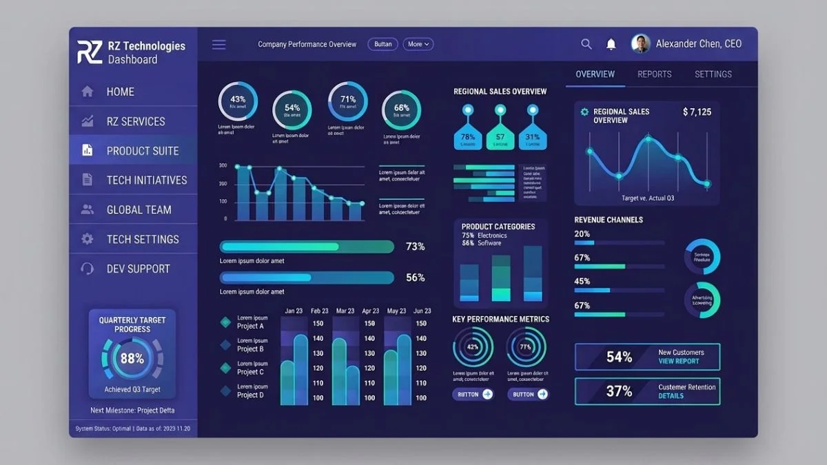
That effect, for example, is really significant for apps and tools that show lots and lots of information: business, financial, CRM, coding, AI dashboards, customer relationship management, etc. These types of products typically have dozens of widgets at the same time: charts, menus, and metrics. The user needs a nice and smooth visual hierarchy if not he would get completely lost.
The designers back in 2026 knew that the trick to reducing cognitive load was not getting rid of everything but presenting information in a way that would make it easier for the brain to do the processing. Dark mode makes this more likely, as the primary elements (like text or buttons) are more contrasted against the background, which is secondary. Therefore, users can very quickly pick out what is important to them while reading what the other thing is in the background without their brain being overstrained. Also, by saving mental effort for problem-solving and not understanding what they have to work with.
Consistency is also a major part. The human mind naturally seeks patterns, as this kind of behavior allows the brain to operate with a much lower load. Dark interfaces of nowadays are a perfect manifestation of a constant layout that includes the same design of elements like navigation, the spacing rules, color systems, etc. With this help the users can learn to expect from a system and hence will be doing the actions with it a lot faster, which also makes it very intuitive.
We all agree that our attention is the most valuable asset in the digital age. Each software aims to capture what little attention the user can give. Psychologists are pretty sure human brains sort out a massive flood of visual input every second, only bringing up images of a small fraction of that.
A very good UI acknowledges and honors this cognitive boundary. Instead of trying to override it.
One of the easiest ways the mind is less distracted is with the switch to dark mode. Interfaces with a strong color palette in bright mode compete visually throughout the entire screen. Conversely, dark mode creates a visual background that is much quieter, and the highlight areas are still able to grab attention.
The above explanation also serves as an example of why many of the modern UI’s adopt a bright blue, green, or purple accent color on charcoal or black backgrounds. The dark background lets a very subtle and unobtrusive color scheme still draw attention and not overwhelm the user. In a well-designed interface, the user is not left hunting down the most important actions; the flow of the interface gently leads the user to the next most logical step.
Along similar lines, another way that designers are saving the attention of the user is through their choice of animations. Designers in 2026 have been more selective in their use of movement. Instead of huge movements or distracting changes, subtle animations together with dark interfaces are helping keep users engaged while reducing cognitive breaks. Things like small movement changes, gentle page turning, and the like are things that enhance the user's actions visually without them losing attention from the main work.
AI has started to play a role in user focus control. AI-driven UIs now learn from the user's behavior and are able to pinpoint the relevant pieces for the context at hand. Rather than showing each notice of equal importance, clever systems show content that users prefer, have previously interacted with, and that is time-sensitive. A dark color scheme is the perfect visual base for such a system because it highlights the main elements easily without making the UI look too crowded.
It's now impossible to imagine daily life without technology. A lot of people spend eight to twelve hours each day being active on devices like laptops, phones, tablets, and other gadgets. With the rise in screen time, emotional well-being is gradually moving toward the digital design sphere.
One of the psychological effects of darkness is that dark interfaces generally make users feel less strained.
Different color preferences among users are a reason. That is, for most users, bright colors are the only choice of color, but some users would choose a different color.
In the case of a bright interface, the user feels it as if the screen light is coming out and it's a big contrast, especially when the user's environment is not well-lit. On the other hand, dark mode fits perfectly well with low-light environments, and the feeling that technology is taking over a big part of the users’ vision is much less with dark mode. This comforting feeling explains why most computer users working till late at night prefer their systems in dark mode.
From the field of psychology, it has been found that our visual environment has an impact on mood. Cleanliness and neatness in visual design help a person to feel in control of a situation as well as have confidence in the outcome. In contrast, a messy layout often makes people uncomfortable or even frustrated. Newer dark-theme-based interfaces tend to be more minimal, leaving a lot of space between the elements, using a few colors only, and very organized layouts. All this contributes to the feeling of peace of mind and thereby enhances concentration.
The digital wellbeing concept has also influenced design direction in 2027. Businesses now increasingly realise that long-term user satisfaction requires a balance of both feature delivery and the encouragement of healthy interaction habits. User interfaces are becoming more respectful of users' attention, energy, and emotional needs. Dark mode is part of these changes, a general move towards human-centered technology.
Human perception is heavily governed through visual symbols. Before they get into how a software application works, users already judge it and decide for a moment if they are ready to give it a shot, whether it's reliable, innovative, or good-looking in this case.
Black color has a long-running link with luxury goods. Executive suits, fine watches, exclusive branding, luxury cars, and high-end electronics are mostly black and dark neutrals due to their associations with confidence and sophistication. Such connotations have little by little also appeared on screen products.
Users perceive a program with refined dark backgrounds, typographical elements of good balance, a bit of shadow, and well-selected color highlights, etc., as being far ahead of its lightly-coloured counterparts. Psychological perception, after all, makes the experience of a product.
That is the reason many software companies launch their products using dark-theme marketing materials. Artificial intelligence, financial, enterprise, cryptocurrency platforms, security, etc., software all tend to use the visual identity of dark as it conveys the message and nature of their products.
Premium perception is reinforced by minimalist design also. Luxury items today rarely use over-decoration. They rely on minimal simplicity and restraint, which they emphasize by giving the dominant visual element a place of its own and reducing the others to very few. Dark mode fits this design philosophy perfectly through the reduction of visual elements to the important information while keeping things simple and clutter-free.
Such psychological impacts of the design have a business side as well. A customer who sees your product as professional may be more likely to entrust your product, invest time in learning it, and recommend it to others. Although visual design cannot stand in for functional features, to a large extent these perceptions determine the level of customer satisfaction with the product.
Trust is perhaps the greatest asset that a digital product can earn. People are entrusting you with their credit card info or business data, sharing confidential chats with coworkers, or relying on an AI helper, so the system better be dependable and secure.
From the very first moment, psychological studies demonstrate that the trust factor starts developing, and a major contribution in shaping those early impressions is visual appearance. Users are prone to linking orderly layout, matching fonts throughout, even spacing, and clear menus together with knowledge and trustworthiness.
A dark theme can foster trust when done right with clarity and consistency. Contemporary interfaces are moving away from over-the-top designs in favor of tidy, structured, and clean presentation. Key points and messages are brought to the forefront without drowning the user in information. Secondary details are made available but not distracting. This harmonious design makes you think this product is under control and you can count on it.
Applications dedicated to security are great users of such psychological facts as they do. Financial institutions, personal info managers, server control panels, and digital security equipment are good examples of those using dark themes as it adds to technicality and formality. Along with encouragingly worded messages, well-structured processes, and honest communications, a dark theme is the kind of tool that helps to create a confident user feeling right from the start.
A parallel line for trust is accessibility. Designers must be able to deliver a decent readability level, an excellent type choice, good keyboard handling capabilities, and also ensure compatibility with assistive technology. If users can't even get the content right or finish a transaction, then no one will be impressed by how nice the page looks. Dark mode design that works is the one where you get the aesthetics together with the function.
Dark mode's development is showing us another big change from how digital design was seen before. Formerly, the software was primarily focused only on how much and how well it worked. The new generation of products realizes that apart from the features and functions, the emotional experience, mental relaxation, and intellectual effectiveness also constitute the core aspects of usability.
2026 designers are really focused on the needs aspect of the user, which they define both as the what and the how a user feels. All the interactions are seen psychologically: Will she/he feel less worried here? Will that color lead him/her to concentrate on that part of the screen? Will those animated effects better explain the situation? Will this format inspire confidence in the user?
Paying attention to these details, dark mode has turned out not just to be a good example from the theory but is one of the few ones in practice where it has really helped. Besides being eye-pleasing, a well-designed product also needs to take into account what people will actually see, what their limited thinking will allow them to process, and finally create conditions in which humans are made to feel that technology supports them, not challenges them.
The coming psychological revolution in interface design will be driven by deep learning technologies, making the user experience even better. From just showing information, they will turn into learning companions of ours in the sense that they understand our emotions, habits, and environment, and thus they become even more seamless and natural in their ways of interacting with us. Such interfaces will really feel like another skin on top with just perfect fit.
There was a dramatic shift in the software industry over the past ten years. Companies aren't just competing anymore to provide more features or sell at reduced prices. In fact, the user's overall experience is now one of the strongest forms of competitive advantage, particularly within the SaaS field.
In the year 2026, most fast-growing SaaS companies will roll out their products in a dark mode as the main UI concept rather than treating it as a small feature of a product. It shows that these companies have gained insight into their customers' minds from a much deeper angle and also learned strategies to ensure long-term engagement.
In general, SaaS apps are built for extended regular use. Most of our office staff, like administrative and operations employees, developers, marketing executives, finance officers, and customer support workers, spend anywhere from 6 to 10 hours a day on the same platform as part of their duties to get work done. During such prolonged exposure, getting on well with your screen is almost as important as mastering your work software. A well-balanced display from a psychological standpoint can keep a user's concentration high, reduce subjective fatigue, and help to create a pleasant work environment.
Using Dark mode is one of several methods available for creating comfort on screen, especially in the current times, where the workplace is no longer fixed, and people are moving and working from several different geographical locations and sometimes in different time zones. Remote teams usually work in different parts of the world, and it is often the case that a person would be working during the late hours or be in a lighting situation that differs from the usual. A dark background helps as well if you happen to be in different lighting conditions without having to manually change the screen brightness levels, which can be tedious.
We also need to consider that using the dark theme goes way beyond being comfortable. A well-executed dark theme often suggests that the product is innovative, technically sound, and stable. Such emotional responses affect the user-product relationship and may lead to a more trusting long-term connection. For SaaS companies, this psychological advantage will be a key factor in retaining their customers, increasing engagement levels, and improving overall satisfaction.
AI changes everything. One of the many changes AI brings to a company's design department is turning once static experiences into a whole new generation of dynamic, interactive, and context-aware user experiences. The traditional approach to a dark mode UI involved users having to select the setting, switching from light to dark or vice versa every time.
On the other hand, artificial intelligence, by the year 2026, will be the engine behind smart interfaces that understand user behavior and automatically adjust visual aesthetics to fit. AI-powered interfaces will keep track of different aspects of the user environment and their device's settings, their interaction patterns, and their habits.
Not just providing one dark theme is going to be a thing of smart platforms; instead, they will adapt their brightness, contrast, accent colors, typography, and layout emphasis, as required by that context. A person working in a room where there's very little lighting, like at midnight, might get a softer, pale color scheme that has minimum brightness, whereas when it's light during the day, the user probably gets a bit more contrast that allows better readability.
This type of behavior, where the system adapts its behavior based on the user's needs, shows one of the underlying concepts of user psychology - people like it when the things around them, the environment, are naturally responsive to their needs. A user tends to rely on technology more when he sees his system reacting to him with sensitivity rather than just giving him orders. AI is capable of taking this principle even further by reducing the number of decisions users need to take themselves.
Making dark dashboards user-friendly is another place AI has made its mark. Smart systems not only prioritize alerts but also make sure the user does not get overwhelmed by notifications. By taking into account how big a problem something is, whether it's something that needs attention soon, how well the user reacted to past messages of a similar nature, and the user's history with notifications, etc., they display the most important alerts most conspicuously and leave the other details on the side.
This is where having a dark interface naturally highlights bright elements really helps out the AI prioritization function.
Brand identity is more than just having a nice logo and picking attractive colors. Customers also get a sense of what the brand stands for by looking at everything that appears in a brand’s visuals. The trend of dark mode as a brand image tool comes from people already having psychological associations between quality and innovation and darkness.
It is no surprise that luxury brands with darker color themes are perceived as more exclusive and sophisticated. The same kind of visuals that are a brand’s visual identity offline are now the basis of the digital product look. The users may not have the slightest idea what the software can do yet, if dark mode is used professionally, along with a nice font style, a very restrained color palette, and a well-spaced layout.
Dark mode is often a way for tech companies to communicate intelligence and innovation to their audiences. Artificial intelligence platforms as well as cybersecurity solutions software, financial analytics software, cloud infrastructure, and developer tools are frequently dark. They reflect a high level of focus on detail, technical expertise, and a modern engineering approach.
The consistency of design also adds to brand trust. When the visuals of marketing sites, an app, a dashboard, the help section, etc., and the customer service portals are harmoniously designed, the users feel more connected to the brand emotionally through the shared design language. Dark mode is a great way to achieve and sustain the consistency of the visual experience of the brand across different platforms.
Dark mode branding is not just the use of a black screen. It is about making use of neutral backgrounds, accent colors that add meaning, nice fonts, and consistent interaction elements to reflect the brand.
Competition being so intense in digital markets, psychological branding will play an even bigger role. Those who know and can read the users’ perception emotionally will definitely be ahead of those who see only their product’s functionality.
Dark mode does make some psychological sense, but there are also situations where it is just not right for some people or even impossible for anyone to look at a dark screen for too long. Interface design is one of the big challenges of modern web and mobile application developers.
To appreciate a person and their limitations, one must understand that people have their unique ways of interpreting visual information. People with light sensitivities may prefer dark interfaces not because they do not like light at all, but the light intensity reduction in a dark interface for them may mean a more comfortable screen time, especially at night.
Conversely, dark mode may seem too dull to someone and very difficult to read if the contrast is not enough. Those users with certain visual limitations might be even better served with a light interface under some conditions.
What is clear here is that psychology is a powerful tool as it teaches us that there is no single solution in design that will cater to everyone perfectly. The design that is centred around humans looks more adaptable while it is not rigid.
Accessibility best practices nowadays urge designers to go a bit beyond the contrast of just black and white. When they use a bit less intense backgrounds with a bit of white text, you can have both the readability as well as the benefits of a dark scheme. In typography, also, font size, spacing, and layout contribute a lot.
Interactive components shouldn't be overlooked. Besides ensuring readability for text-based content, interactive elements such as buttons, links, menus, and form controls also should be visually separated from surrounding material so as not to confuse a user. The problem of a person not being able to figure out where the interactive area ends or begins because of low contrasting colors with the rest of the content or of the interactive element having different colors from others in the design should not be allowed to occur.
Accessibility is not just for people who are blind or have visual impairments. Other forms of accessibility such as keyboard navigation, screen reader-friendly content, responsive user interfaces, and intuitive user flows are all factors that ensure a wide range of people will have access to the content. In fact, dark mode can't really work for most folks unless it enables those same users to work more quickly, accurately, and comfortably.
A greater concern for making a piece of software, etc., accessible is a sign of a broader understanding that good design is something which takes humans with many needs and abilities into consideration and tries not to limit them with its own characteristics. As one of those human-made systems that can do amazing things when it meets different people's needs and helps them with their problems rather than trying to get them to fit it in their own way, technology becomes valuable in that it works with people and does not force the user to adjust themselves to fit the technology.
Enterprise applications tend to be psychologically demanding due to the fact that users are constantly dealing with huge amounts of information and under time pressure, for instance. One example is an operator in front of an equipment monitor. Another one is an analyst working on the numbers. Yet another one would be a manager who supervises various departments.
Users at such levels of decision-making have the ability to multitask and also have very limited time for each task, so that even a small extra effort can make big differences in productivity. Hence, the design of a system for this sort of user has to be very carefully considered, as any delay in finding the information a user might need can have a huge impact.
Dark enterprise interfaces have gained significant popularity, especially because they help in organizing information better while leaving the user free to go at their own pace without feeling overwhelmed by the screen.
Contrary to assuming that all widgets or elements in a dark dashboard are equally important, designers make better use of contrast and color to communicate the hierarchy of the information.
Take charts as a case where psychological optimization is most obvious: bright and colorful data lines and points jump straight to the viewer's eye when they are placed against a dark background. At the same time, fine grid lines and subtle secondary labels are clearly visible so as not to be an eyesore for the viewer of a chart.
Such a subtle but clever design makes it a very efficient way of presenting a large amount of data.
Dashboards that monitor real-time data have a lot to gain from the use of dark mode. Security operation centers, network monitoring platforms, etc., often work around the 6. In these situations, dark modes are particularly effective as they lower the visual fatigue of the display while leaving the key warning signals easy for the user to spot.
According to psychological findings, users work better when the interfaces they use support their natural way of scanning through information. The use of such features as putting the most critical metrics in a standard place, having the same-looking designs everywhere, and not overdecorating is very typical nowadays in enterprise dashboards. With the dark mode on, the focus comes more directly to the main content and the attention is not divided between it and the background.
Dark mode is especially helpful in enterprise dashboards when combined with AI features. AI enables dashboards to know which users need specific metrics, as an AI assistant is able to predict the users’ requirements on the basis of their job or responsibilities and their past behavior.
Instead of having to work with generic dashboards, users are presented with dashboards that tailor content according to the user. It turns out to be a much smoother process, and one’s ability to make decisions is enhanced; with dark mode, the interface becomes more intuitive.
Many large technology companies behind famous products have gone with dark modes just because it works well. In fact, they have done so even if they did not like the color very much as long as it made things look more friendly and less intimidating.
Their main reason is not fashion. It is simply the fact that dark mode is more comfortable to the eyes, especially those who spend many hours in front of a digital screen.
You name it - from a word processor to video editing software and finance-related apps to even artificial intelligence - all the digital workspaces seem to follow this dark theme. They not only look cool, but the designers also use the principles of human psychology to improve the interaction in various subtle ways.
Products like Apple iWork applications and Adobe Creative Suite that appeal to different types of customers still follow certain design features. Their interfaces have minimal distractions, keep elements in harmony with one another, use limited colors, and foreground the content more than any other decoration. The typeface stays highly readable even when the text is set in a small size, the navigation is straightforward, and the actions have instant results.
Hence, such a combination leads user satisfaction to the level where people think these products are trustworthy and the design is easy to figure out after the very first use.
Dark theme is another area where they exercise moderation. Dark mode designs in general tend to stay away from fancy gradients, shimmering effects, or too many animated elements. They highlight only the details that help usability but do not distract the user from the main purpose. In other words, a modern minimalist approach of dark mode is based on the idea of less is more, and that it leads to strong emotional reactions even more than complex designs do.
Dark mode is not a major contributor to the overall strategy but is rather a small one of psychological design on the interface level.
All the visual cues from first-time interaction to the messages about mistakes have been designed to make your use of the interface almost seamless, and you feel safe and trusted by it at the same time.
The introduction of new digital technologies into existing products is happening at a record pace. Dark mode is the feature that will likely go through the most dramatic changes since AI, personalization, and behavioral design have come to it with so many new tools.
Dark mode will become something else as technology becomes more human-friendly and not just another fixed visual theme. Interfaces will adapt constantly and even react quickly to human needs, the surrounding conditions, one's mental state, and personal preferences.
This is the transition from design that is driven by interface to experiences which are human-centered. Now it is the technology that gradually adjusts itself to the user instead of asking the user to adjust to technology. Dark mode represents the perfect combination of appealing design and a solid psychological base for this new direction.
Such a shift in the way things work will be a big change for designers, software programmers, and business people. It won't be sufficient just to apply dark colors for dark mode, and you'll still be far from making a really dark product. Instead, you'll have to get to know more about how our minds perceive things, process information, feel emotions, become disabled, and so on. Also, you are likely to become knowledgeable about branding and behavioral analysis, to name just a few fields. As a matter of fact, those who will succeed in integrating their understanding of these areas will not only develop a product that looks great but also makes a user remember, feel good, and, most importantly, help them in the process of living a better life.
Dark mode started as merely a visual customization option, but over time it grew to be a whole design philosophy.
The evolution of digital technology makes the dark mode design less to do with the color palette and mostly to do with user experiences that are tailored to the preferences of individual users.
Instead of showing the same interface to every user, modern apps will figure out who the user is, what the user is going to do, and where the user is working to determine what the best UI experience for the user will be.
The change in dark mode can be driven by AI, which will be the major factor in it. Today's AI tools are already able to understand a user’s behavior based on interaction patterns, frequently visited sections, layout preferences, and work schedules. Soon, these tools will start using the knowledge they have learned so far for a better visual experience for users. Users will no longer need to manually activate the light/dark theme as the intelligent UIs will automatically recognize external lighting conditions, the display type, user preferences, etc., for the most seamless and eye-comfortable viewing experience.
An innovative idea, context-aware interface: If during business hours a workmate is analyzing a financial case, he might get a display with more intense colors, clear fonts, and information-rich panels, which will promote the making of informed decisions. However, the same person after work, at home, might be presented with a softer color palette, fewer notifications, and more soothing visuals to avoid the feeling of tired mental activity. This type of customization clearly reflects the idea of technology that can adjust to human needs instead of humans being obligated to fit around technology.
With new display technologies, we'll have the design of dark mode change even more. OLED and MicroLED displays will show better color representation, deeper contrast, and much lower power consumption.
Using modern display tech, designers will be able to have more creativity to do subtle visual storytelling without the fear of readability issues. The shadows, gradients, and depth that are used today will make more use of the potential realistically, but also the accessibility and performance will remain top priority.
Voice interfaces and conversational AI will change the way users communicate with their devices as well. Once productivity tools and enterprise solutions become fully integrated with voice assistants, graphical interfaces are going to change their focus from showcasing a lot of information to being more of a conversation support tool.
Still, dark mode will not only help these types of interactions through visual noise reduction and highlighting important content; it will also make the overall experience more enjoyable.
AR and VR will also benefit our interaction with dark mode. During very intensive times in immersive environments, we need to be comfortable with lighting and contrast changes to avoid physical discomfort.
Dark mode will make the perfect fit for such environments because it will help the user's concentration not to waver, the focus still be on what’s shown in front of the user, and virtual content will be the dominant element.
The rise of spatial computing will mean that much of what we have figured out so far about dark mode will become quite essential in the development of new interfaces in 3D as well as 2D spaces.
In the end, what we have on our hands is a different kind of dark.
The future of dark color mode is not about making the color of the screen even darker. Rather, it's about generating digital products that are aware of how a person behaves with technology, are designed to protect from overthinking with minimal mental strain, and can be changed with time and place.
For quite some time, interface design centered on the idea of getting the job done first. If there was no user struggle with task completion and designers knew it, they would see the product as effective. The view has, however, turned completely upside down nowadays. Good digital products cannot be judged by the quantity of features they offer, but also take into account the level of emotional experience they create.
Because psychology is a very powerful discipline that helps uncover how people process information and decide things, how they earn others' trust, and form habitual behaviors, the discipline has gained importance and has now become one of the top areas in modern design.
All interactions in a product impact psychological processes. When it comes to digital products, colors are emotional tools, fonts can be the main factor in readability, spacing affects clarity, and animations lead eyes here and there, whereas navigation structures can be the deciding elements of confidence. The combination of different factors in a harmonious way is what leads to user experiences that make their minds open (or closed) for the product.
Different dark interface design mode examples, the use of colors in them, how to change from one style to a new one, or even how to keep on using it for several reasons without getting bored with it are discussed.
The first and the most basic level of understanding people's motivation for dark mode is the aesthetic aspect and how it can prolong battery life, but if dark mode had only been that, its growing use across different platforms would not be surprising today. People pick dark interfaces because they often have a calm atmosphere, they can be more focused and serious, and their level of concentration can be higher. These kinds of emotional reactions make users stay longer, enjoy the product more, and get even closer to it.
More and more businesses realize and embrace the psychological design aspect to their advantage. A customer who likes a product is more likely to be loyal to the business, recommend its product to others, and explore more features. Positive emotional experiences that the customer goes through will eventually boost the company's retention rates, enhance its image, and ensure healthy business expansion.
If AI keeps evolving and becoming smarter, then psychology will be even more significant in product development and user interface design. Tomorrow's machines will not only figure out what users have done but also understand their needs and predict the right time when a person wants to accomplish something. Designers of future products will have the power to design human-compatible and human-aware machines that they will make comfortable, reliable, and predictable for users, so no one is afraid of new technology.
The appearance of dark mode is one of the trends marking contemporary digital product design, but the reason behind the use of dark mode by so many people reaches more than just the visual aspects. The mode represents a new understanding of how individuals get their information from technology, how human beings perceive information, and how emotions affect people in their digital experience. The emergence of the dark theme, among other things, indicates a transition towards designing primarily for people, where psychological comfort, cognitive efficiency, accessibility, and emotional well-being are no longer secondary to the technical aspects.
From this article, we learn that the usage of dark mode has a positive effect on a user's visual perception, lessens mental load, fosters attention, creates a sense of belonging to a brand, strengthens trust, and promotes satisfaction over the long run. The text also covers the increasing role of artificial intelligence in bringing out products that have adaptive interfaces and allow the product to modify the user's experience depending on the user's characteristics and environmental conditions.
Not the ones that rely on highly advanced technology, but those understanding people will lead the market of digital products in 2026. Recognizing the relationship between a design element, on the one hand, and the attention, certainty, desire, and emotion, on the other hand, helps one better understand the role of design in making users feel and act in certain ways. Since it creates settings that give one the feeling of being relaxed, orderly, and goal-oriented, dark mode has become one of the components of this concept.
Sadly, however, only swapping white backgrounds for black ones in dark mode doesn't really make it great dark design. Designers are in charge of making a good mix by carefully balancing typography, contrast, spacing, accessibility, color psychology, and user behavior in general to produce an enjoyable and effective user experience.
The dark mode psychology is a study on how dark user_interfaces can affect a person's perception, attitude, emotions, thoughts, and decision-making. The reason being dark mode themes have become the norm nowadays, and this trend is a huge driver of the dark mode psychology study - dark themes tend to create a calm/professional/focused/ and sophisticated mood while minimizing visual interference.
People like dark mode because it provides a great visual experience, in particular in low-light environments. Many people connect dark mode with state-of-the-art technology products, premium items, and professional software, all of which are perceived as more engaging and fun.
In some instances, dark mode might be a more visually satisfying option for users in environments with low light due to the reduction in overall screen brightness that it results in. However, the impact of dark mode on eye discomfort varies depending on the light level, the text-to-background ratio, the size of the text, and the preferences of the user. In fact, dark mode is not considered a one-size-fits-all remedy for eye fatigue.
Dark mode may increase efficiency as it can generate a more visually clean environment that is able to highlight the contents of main interest while at the same time minimizing distractions. When paired with a well-thought-out layout design and a clear information hierarchy, it could even help users stay focused for a longer duration of time.
Dark colors have historically represented luxury, exclusiveness, self-confidence, and sophistication. These connotations, in terms of color psychology, make dark tones a favorite of high-end brands to highlight product quality and professionalism, both when it comes to hardware and software.
because it allows charts, graphs, notifications, and key performance indicators to be in sharp contrast while background features keep being visually unobtrusive.
The integration of dark mode and AI leads to a dynamic and user-centered dark mode, rather than merely the default dark settings. AI can fine-tune the brightness, contrast, layout, color palette, and color accents depending on user preferences, ambient light conditions, device settings, and user context.
It’s definitely a major issue. Dark mode should be accessible, so a dark background would ideally have good color contrast and readable characters. Navigation should be intuitive and assistive tech-compatible. Beautiful design is of the least importance compared to the satisfaction and comfort of a diverse group of users in interacting with the design.
Beyond a doubt, yes. With artificial intelligence (AI), customized user_interfaces, and virtual reality (VR) becoming the next normal, dark mode is projected to evolve beyond a simple switch to one that will intelligently and automatically change with the user’s situation.
The biggest designer's lesson from dark mode would be the point that a beautiful-looking product is not enough. Besides, if we can look inside at the psychology of people, human cognition, accessibility, and how emotion plays into our decisions, we have the key to building a product that users will not only enjoy but come back to again and again.